Highland Park Kitchen 2
With a footprint of just 10 x 12 feet, renovating the kitchen in this otherwise lovingly restored Tudor-Craftsman home presented a challenge—but after living there for almost 30 years, the recently retired owners were ready to pursue their vision.
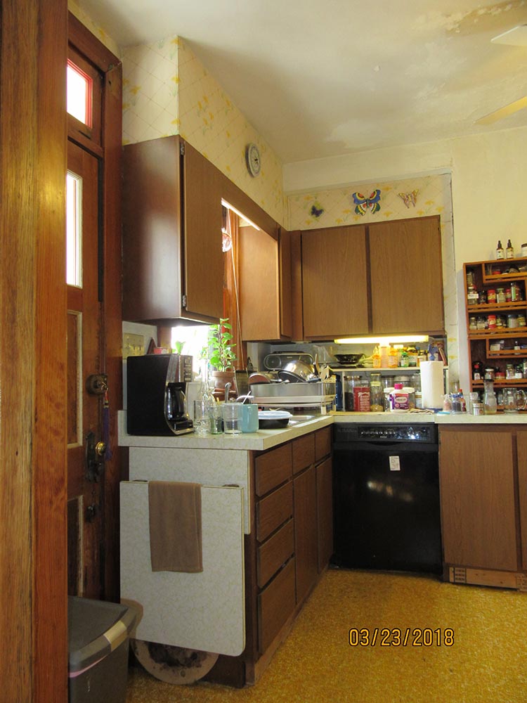
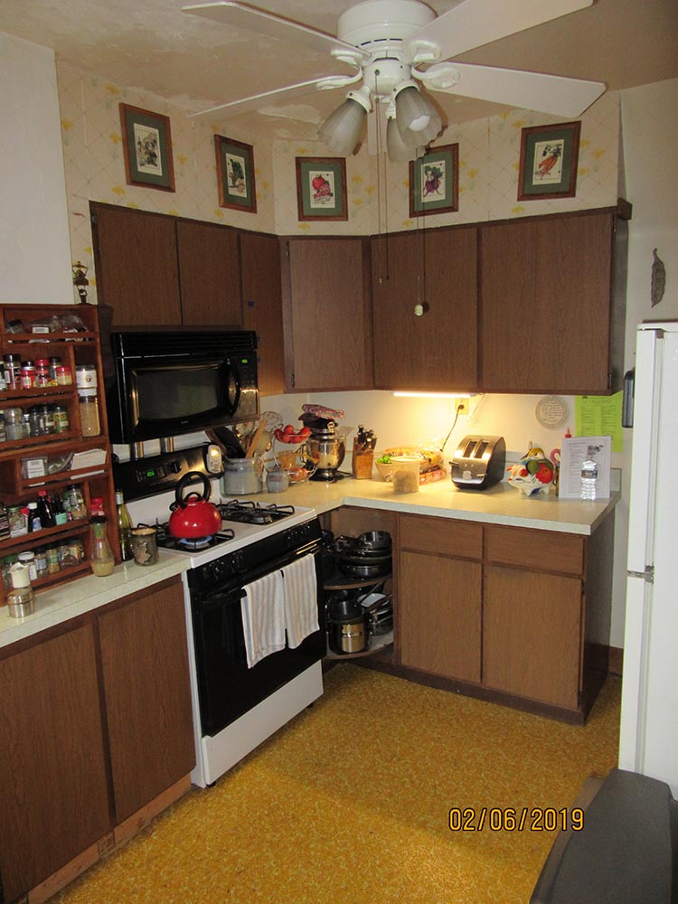
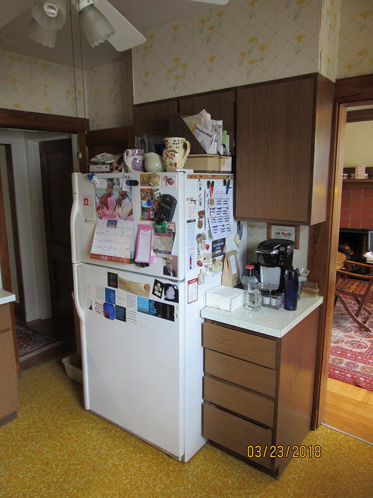
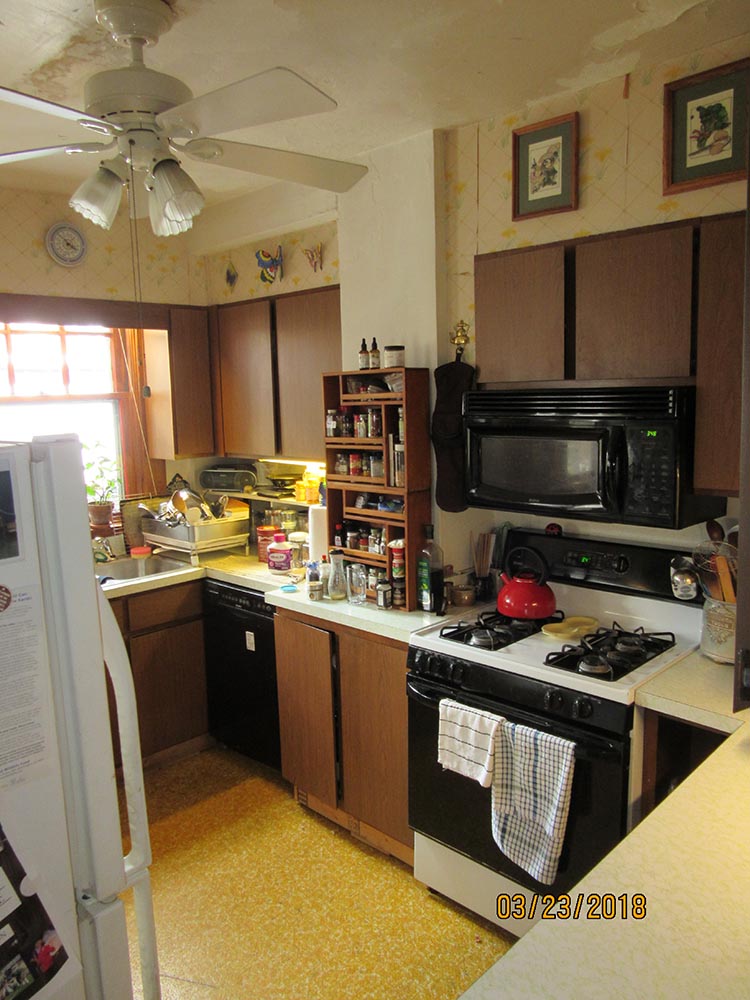
Cabinetry and finishes dating from the 1970s made for a decidedly dark and claustrophobic look in the existing space. This impression was only accentuated by the location of a bulky old refrigerator which, in addition to interrupting the view, also constricted the path of travel into the room to a preposterously tight 15 inches. The sink area was also particularly cramped, with the swing of the dishwasher door making access extremely awkward.
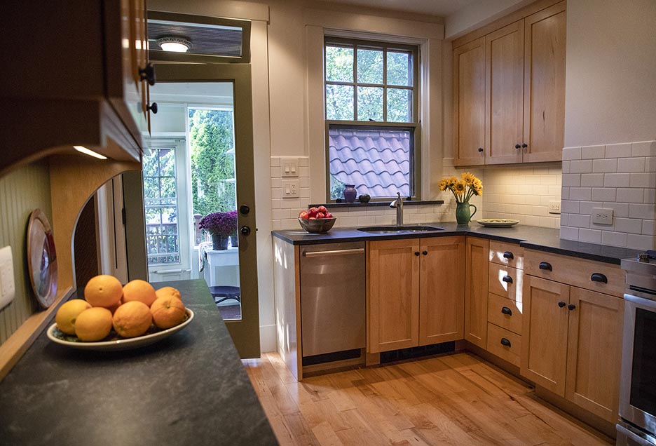
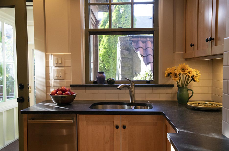
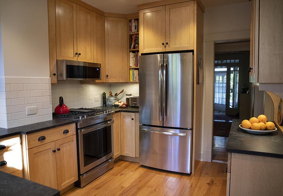
Shifting the location of a new counter-depth refrigerator to an adjacent wall greatly enhanced the room’s sense of openness, admitting daylight much deeper into the house and also expanding the view to the owners’ charming garden. A new rear full-glass rear door similarly contributes to this effect, while a newly operational transom helps to catch the summer breeze.
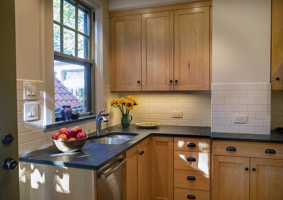
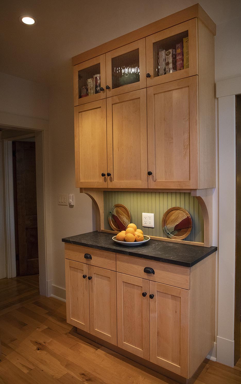
The simple lines of new Shaker cabinets harmonize with existing carpentry details throughout the house, and extending them almost to ceiling makes the most of every inch to maximize storage space and minimize countertop clutter. The “hutch” cabinet with its simple brackets and beaded board backsplash alludes to freestanding Hoosier cabinets that were prevalent in early 20th century kitchens—and also creates the perfect spot to display some of the owners’ colorful handmade ceramics.
Wide-plank maple flooring, honed granite countertops, and a matte-glazed subway tile backsplash all contribute to the project’s overall sense of restfulness and informality.
Completed project photos by Jessie Wardarski.
Before Photos


